This page is a backlog of creative projects done that are not games (because, well, games have its own page already!)
This document details images and websites made, also available at http://johannes.smidelov.com/creative-backlog Please refer to http://johannes.smidelov.com/games for game project examples.
Ad campaign – Järfällacentern budget 16/17 successes (2015)
As the responsible person in the party ring (i.e. “Järfällacentern”) for online ads, I was asked to develop a Facebook campaign to advertise the party’s successes and fulfilled election promises in the coming budget. This took two main iterations – one more exploratory, as we had little experience to draw from – and one to set the details.
I biked around the municipality to get good photos from locations related to the successes, and then assembled each in paint.net. Before the main campaign, we ran a pilot campaign to learn Facebook’s workflows and payment model.

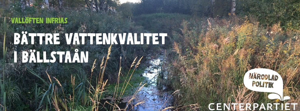
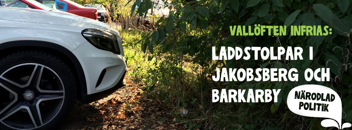

Related to this, a follow-up campaign was initiated later. At that time I had left my responsibities due to external circumstance, but I fulfilled what I had promised and delivered an image properly following the party style guide, this time made in Photoshop. I’m not really happy with the details, sadly (images are too close, there’s not enough white space, the two greens are too similar without being the same).

Website – eurostep.com (2015)
The CEO seemed happy enough with pdteurope.com’s migration to WordPress (see next chapter). Many of the same requirements as for pdteurope.com, which we now were aware of and made explicit at the start.
In a way, the pdteurope.com website was a pre-production to this, and using the previous site as a template made building this site a quick process. And with it as a learning experience, I was now also more comfortable using child themes and site-specific code to build upon the theme and plug-ins used.
Because no predecessor existed for mobile resolution, the creative input – and challenge – was to make the site look good on mobile, tables and all viewport resolutions in-between, while being next to identical on desktop resolutions.
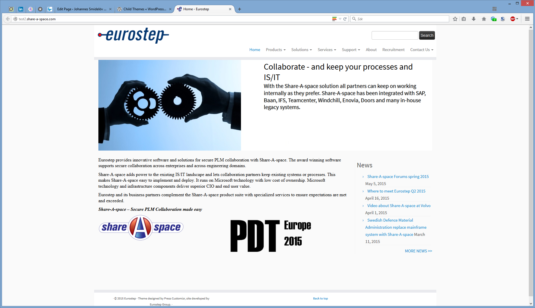
The front page. Like the project below, the order was “don’t change anything”. The most tricky part here was to use the slider at the page top to simulate two divs, while being readable in all page sizes. With some different text-scaling at each break-points and a max width at wider windows, I believe I pulled it off in the end.
Website – pdteurope.com (2015)
The CEO wanted to move their website for their yearly conference to WordPress. Working with business keen about safety and security, the top requirement was that the site should be as similar to its 2012 predecessor as possible.
The site is mostly the previous texts and news articles, with the theme Customizr and the minimum plug-ins necessary for the site to function.
One of the more complex features were to let users purchase tickets from the website, pay through Paypal or requested invoice, gain the receipt and make these integrate in a convenient for the accountant/administrator and project manager to work with. The module used here was EventEspresso, and the challenge came from adapting its US-centric design to Swedish business conditions.
Project-wise, time was added by an absent pre-production, causing requirements to be discovered half-way through.

The immediate front-page to the conference. As the order was “don’t change anything”, I didn’t have the mandate to attract a visitor to the registration page from here.
Newspaper supplement – Center party of Järfälla county (2014)
I was asked by the Center party in Järfälla county to do a 4-page supplement in the local newspaper, to release the Sunday ahead of the general election of 2014. To be sent to the printing presses in time for publication, I had a week to get the texts and material (the party had developed a unified art style ahead of the campaign, and had distributed the resources to follow it) and assemble the four-pager. Worth mentioning about Swedish general elections is that there are three different elections the same day, so answers for gaining the readers vote had to be sent for all three elections.
I used the open-source tool Scribus to assemble it, which was a first. I was sent some reference material to speed things up, yet had some resources not quite built to be used for this (this is why the Mr on the left-most page below seem a bit too short). Some texts also needed to be trimmed to meet the requirements set above.
Images were scaled using Paint.NET, vectors were edited using InkScape.
A lesson learned from this project is to make certain you have the correct page/canvas size set in the tool before you plan how to fill it. This is notable on the second-most left image below. This caused quite the dead-line stress, but it got corrected and completed in time.
-
- Front page
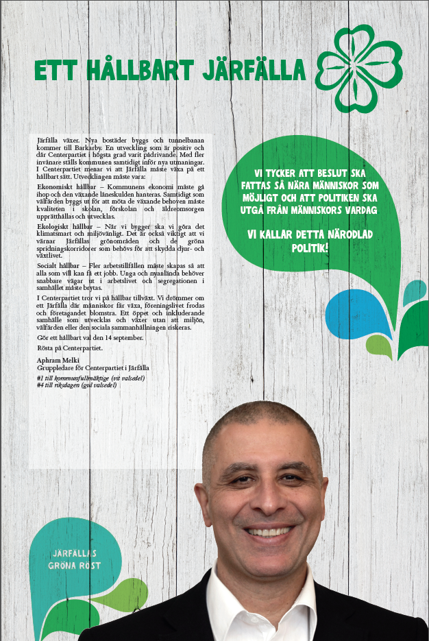
-

- Inner-left page

-

- Inner-right page
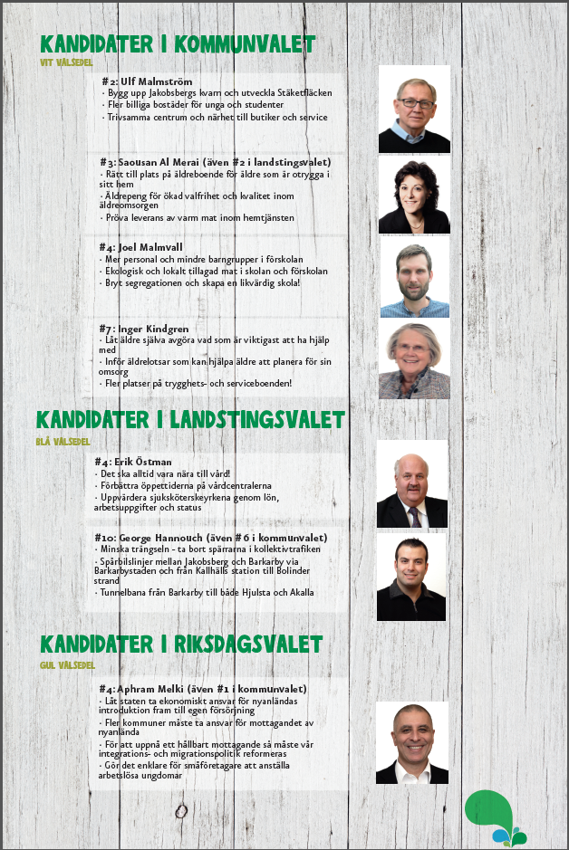
-

- Back page

Flyers – Share-A-space (2014)
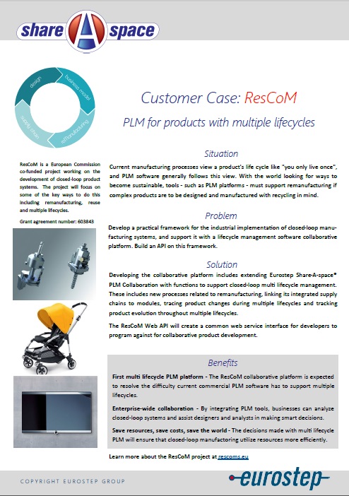
I noticed the marketing material hadn’t got much attention in a few years, and managed to get asked to give them a facelift. The colour palette and direction was set since before – the product has been out for years, as was the company’s style – so I had to get a sense for all these cases.
These flyers were strctured with one unique side for each case, and a common side explaining the product. This copy was a collaborative effort between me and the marketing guy. They were layout using Microsoft Publisher, and images were cropped using Paint.NET.
The pictures were taken from press galleries and material published by the customer, and was picked to set the mood while still being factually correct. The layout also went through a few iterations before this one was settled upon.

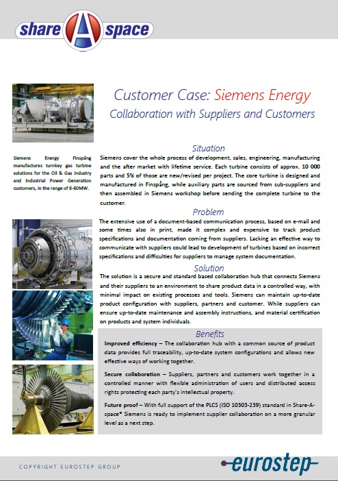

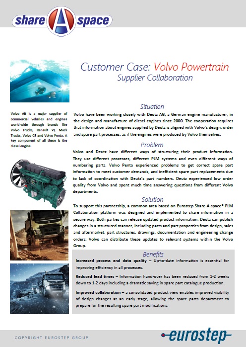

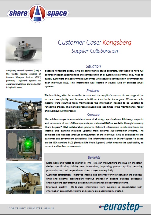
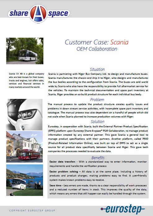
Posters – Election committee for the student union (2013)
In 2012/13, I was on the student union of Skövde’s election committee. After many years of maybe-OK election committees at the union, our committee was decided to do it “by the book”. This mostly in regards to time window, but I wanted to use the tried-and-tested placard to draw some attention.
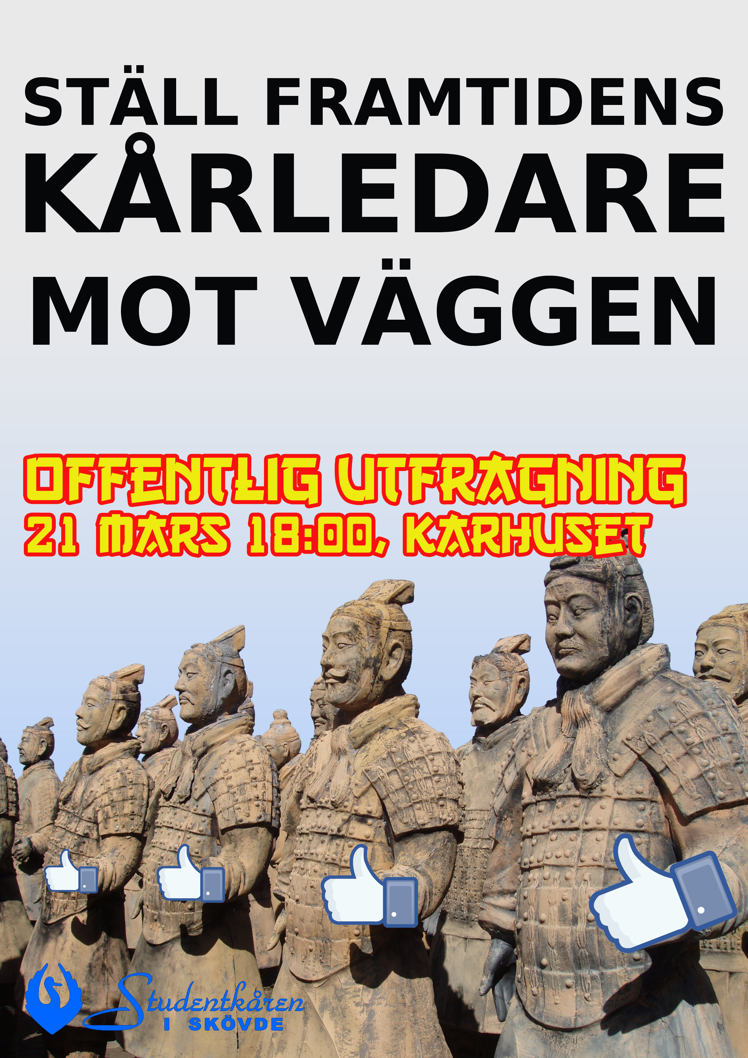
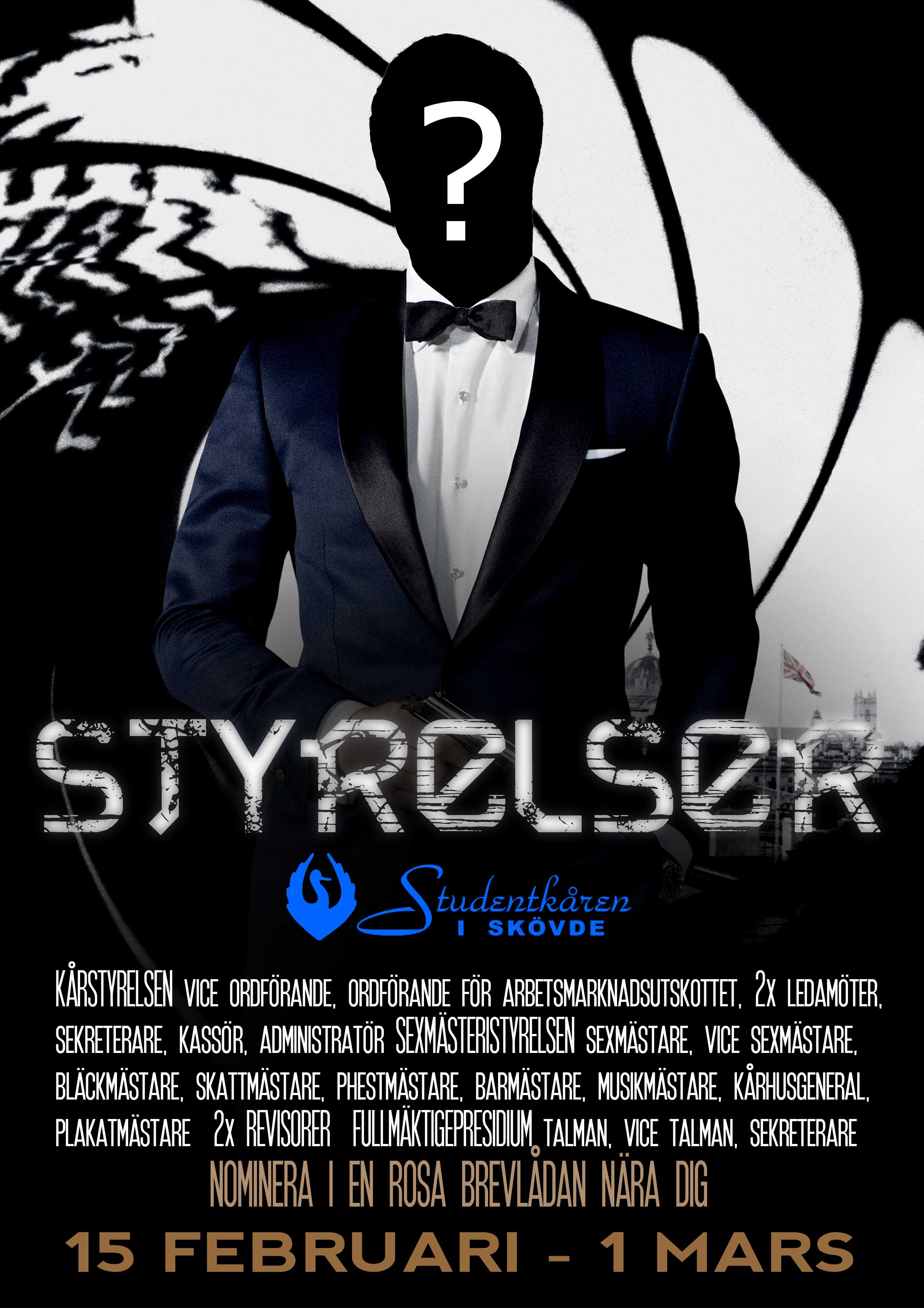
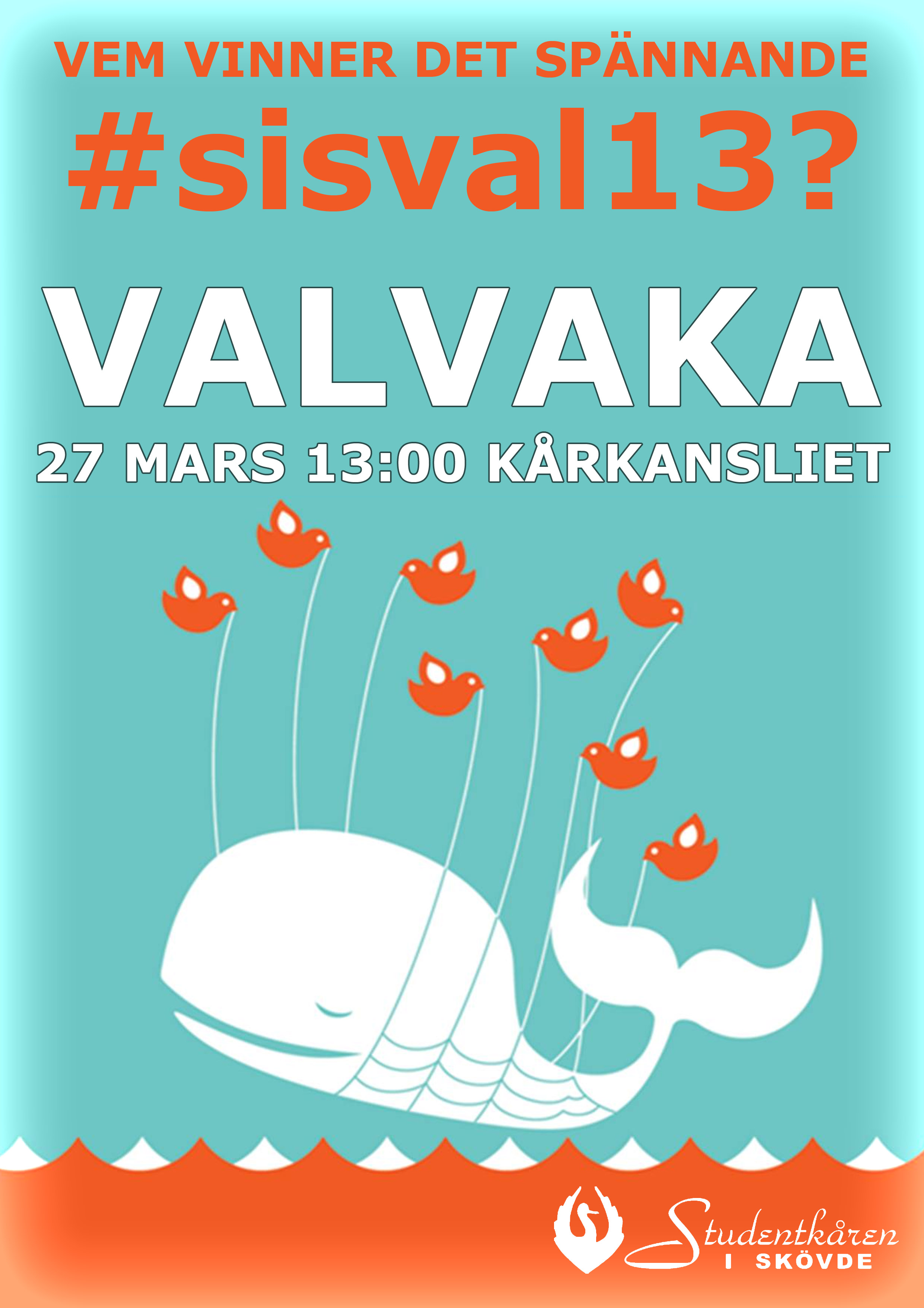
These all have some pop-cultural reference (the Obama “Hope”-picture, Agent 007, facebook Likes and Twitter’s “service overloaded” respectively) and a more geeky reference (“All power to Tengil” from The Brothers Lionheart, the text-on-movie-posters-nobody-reads, the Terracotta army and a pun – “election” in Swedish is a homograph to “whale”). The intent here was to be recognizable to as many as possible, while playing on the student culture of puns, memes and trivia, while conveying the message the poster was there to tell.
They were made using Photoshop.
The two left-most posters went up first, and I got some spontaneous encouraging feedback for them. The two latter went up later, and were mostly ignored.
-

- “All power to Tengil”, a Brother Lionheart reference, used to encourage nominating a friend

-
- “Push the future leaders against the wall”, used to attract people to the public questioning of candidates
-
- This movie-inspired poster was used to communicate what positions were open for candidates, and make it feel cool(er than it is)
-
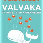
- An attempt to make the vote-counting more engaging than it is, a hashtag was invented. To my knowledge, nobody used it.
Website– Coilworks.se (2012)
Knowing we needed to have some kind of online presence once we got any attention, and everyone else being too busy game-making, I set out building the website. We knew there had to be contact information to reach us, that we wanted a place to describe our game and that we could scale it up the day new demands were put on it.
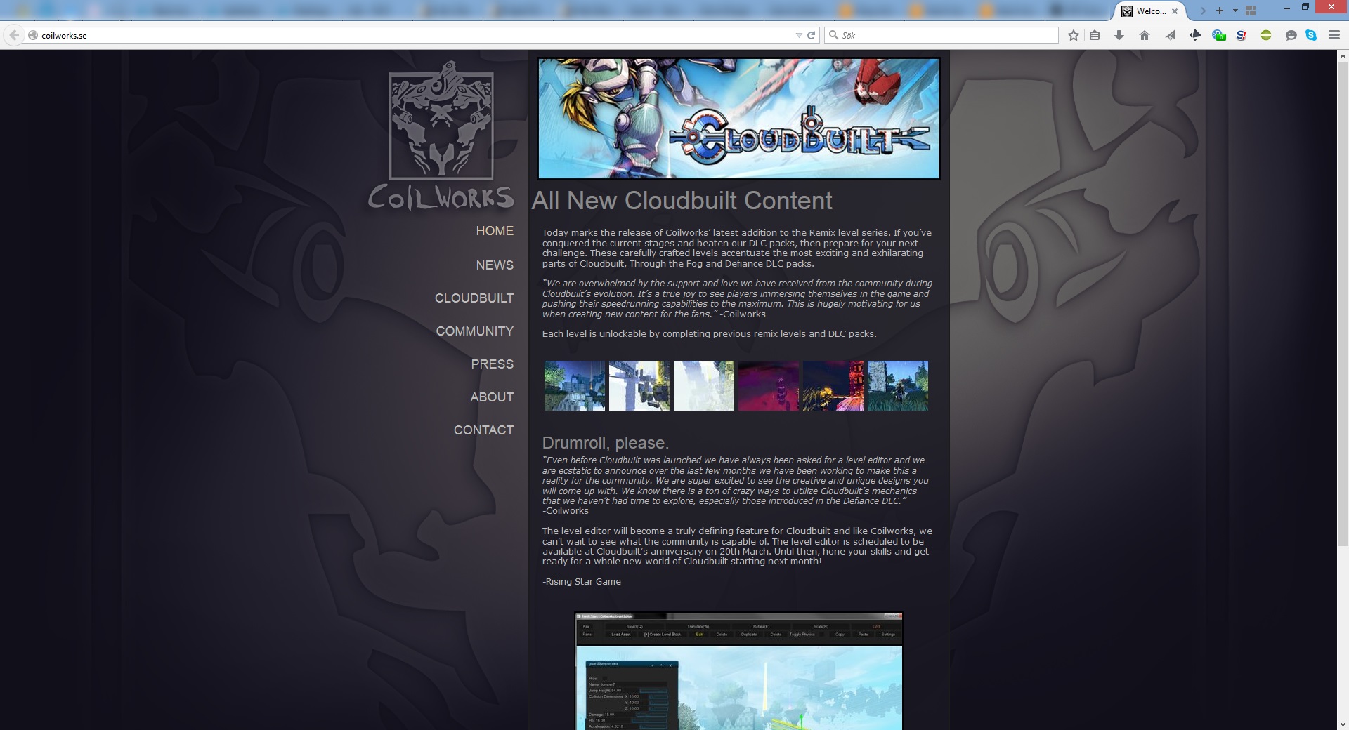
Using one.com’s tool and very limited art resources (the image below was taken much later, when more resources had been made), I looked at the fashionable websites at the time, and then iterated with the rest of the team for feedback and directions.